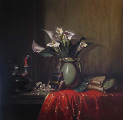
 A few years ago, I painted several pieces using the ever beautiful calla lilies as a focal point. Here I have mimicked one of the earlier compositions while changing a few objects and brightening the red tones. Using a white or off white object as the main attraction is very auspicious in color palette planning. Because white goes with anything, the other hues in the painting harmonize with each other easily without confusion of too many colors.
After many many months of using the historical color palette exclusively, I find I much prefer a simple analogous scheme with a complement and discord. Within Day of the Callas, 30 x 30, are endless varieties of earthy red tones (one side of the color wheel) with a very muted green accent and a blue/green discord in the book and ribbon. By using just a few colors over and over again within the composition makes for fewer headaches during the painting process.
