Out of all seven women featured in this series, Angelique Marie Lilly Martin Spencer was unique for her outstanding and magical upbringing. Born in England in 1822 to French highly educated parents, Lilly was encouraged to pursue her artistic path at an early age and had the added benefit of a home-school education. The family relocated often first … [Read more...] about Dancing the Quadrille Backwards with Lilly Martin Spencer
Chiaroscuro and Other Oil Painting Techniques
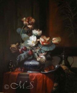
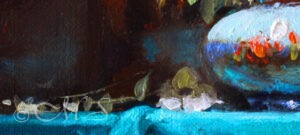
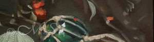
Chiaroscuro is from the Italian language and the root meaning is chiaro, light, and scuro (obscure), dark. It is a perfect technique to use in oil painting to achieve drama of contrasts such as that used by the 17th Century Dutch. Another technique that helps attain this look is impasto oil painting, which is used freely in the main focus of the composition and then to a lesser degree in the shadow areas. It is very effective in all sizes and subject matter such as oil paintings of flowers, still life, and even landscape. Fumed Silica gel is a great medium to use for getting texture in oil painting. It is a combination of linseed oil and silica mixed together which forms a fluffy clear medium. When mixed with paint, the consistency retains its shape and stays put with no slumping.
Doing the Minuet Backwards in the Peat Bogs of Norway with Christine Kitty Lange Kielland
One of the most inspiring facets of doing research for my Lessons Projects over the years, is the discovery of the unknown. For my first pigment exploration, I learned about colors available to and used by the 17th Century Dutch Masters. Then came the Golden Age of Greek Art in the 5th Century BCE. After that the Native Americans of the Southwest … [Read more...] about Doing the Minuet Backwards in the Peat Bogs of Norway with Christine Kitty Lange Kielland
Doing the Mazurka with Emma Sandys
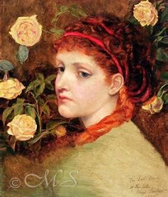
Like Elisabetta Sirani, the first featured woman artist in this series, Emma Sandys had a tragically short life. When she died at age 34 of respiratory illness, her death was announced in a simple notice rather than true obituary or a celebration illustrating her artistic accomplishments. Norwich, England was her birth city where she lived and … [Read more...] about Doing the Mazurka with Emma Sandys
Adelaide Labille-Guiard; Folkdancing Backwards
Adelaide Labille came from a more modest background than the previous three women featured in this series. In spite of this, she rose to fame and became known as the greatest women pastel portraitist next to Rosalba Carriera. What is noteworthy to me, is even though many women artists rise in fame during their lifetime, their prominence fades over … [Read more...] about Adelaide Labille-Guiard; Folkdancing Backwards
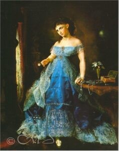
The Queen of Capri Waltzed Backwards in Button Boots: Sophie Gengembre Anderson
One common thread with many women artists discussed here is that they were born into well-to-do families and had successful and influential parents, usually professionally educated in the arts or sciences. This is very true of the French artist, Sophie Gengembre Anderson whose father was both an architect and artist. Though she was born in Paris, … [Read more...] about The Queen of Capri Waltzed Backwards in Button Boots: Sophie Gengembre Anderson
Dancing the Rigaudon Backwards: Rachel Ruysch
Unlike the previous featured artist, Elisabetta Sirani, Rachel Ruysch lived a long and fruitful 86 years. It’s no wonder her passion for art developed early with a penchant for natural marvels like flowers, butterflies, lizards, and other creatures because she was raised the daughter of a physician/anatomist and botanist, Frederik Ruysch. Fortune … [Read more...] about Dancing the Rigaudon Backwards: Rachel Ruysch