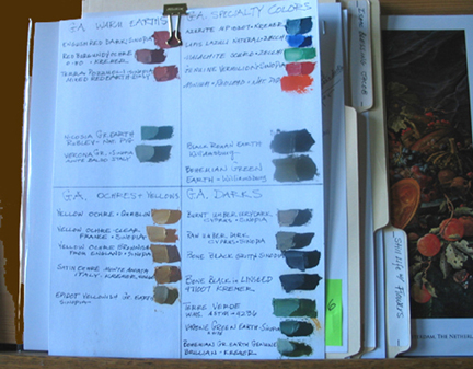
Since the inception of this project, documenting each pigment has been carefully carried out in 3 places; on each tube, and on two charts.  Nancy and I have made quite a few now and it is amazing how vastly different the pigments are, not only in hue (color), but saturation, and texture also. It is easy to see why some went out of favor and some remained a staple on the palette. Yellow jarosite is a bright yellow ochre tone and when mixed with white turns a subtle grayish yellow. But the texture is very strange with unusual brushability qualities. When trying to add the color to this chart, it would just roll off my palette knife and not stick to the paper. However, when mixed with white paint, the consistency is very good, and the color is a very soft subtle grayed yellow.
According to Natural Pigments jarosite has only been recently discovered as being the yellow pigment in the murals of the temples of Karnak, Egypt. It is lightfast and has good hiding power, meaning it is opaque not transparent. Eventhough it has been used since antiquity, it did not get its name, jarosite, until 1852: originating from, Jaroso Ravine, Spain.
Another very strange pigment is epidot which is found in Russia and Austria, and there is almost no information about it. It has a hue that could be described as a golden pea green, and when mixed with white has a low tinting power but is quite lovely. However, the texture is unpleasantly gooey (Impenetrable Goo, a previous entry. It must be used immediately after making it or it turns gummy and not brushable at all. I think I will hold off using this one until I find more information about it.
Another quite surprising quality is the difference between the same pigments that are purchased from different suppliers. A lemon ochre from Sinopia can be very unlike one from Kremer, in color and texture. This is certainly because of where the pigment is mined. But this is a very common occurance in the art world. Even tubes of paint from the well known paint makers will vary from batch to batch, and is not uncommon at all. You just learn to deal with it and adjust your palette accordingly.

Margret, this is fascinating! I love the photo of your pigment notebook. You definitely need to display it in your exhibit, don’t you think?
The Promise of Spring
After seeing a fascinating website with all sorts of info about natural dyes I came across artist Margret Short’s notebook of color samples created using a variety of artists pigments. All the gorgeous colors made me think of flowers poking their heads…