Back in 1994, when I was just barely sure of what I wanted to be as an artist, I found an intriguing semi-official survey taken by two serious-minded artists named Alex Melamid and Vitaly Komar, both Russian emigres. Along with other art preferences, they set out to find which color is most overall favored adored and desired by ordinary folks, both artists and non. The survey results were then published in The Nation, March 14, 1994, issue titled The Search for a People’s Art. For some strange reason, this story made a big impression on me, and I have saved a highlighted and notated copy all these years.
Quintessential Blue: The Legendary Hypnotic Reputation of the Undeniably Favored Color of Almost Everyone
For Melamid and Komar’s project, pure hues, shades, and tints from offshoots of the primaries, secondaries, tertiaries were surveyed by approximately 1500 people.
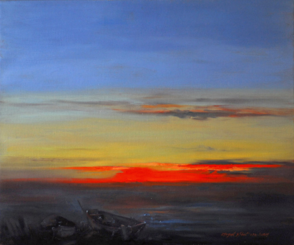
Cerulean and Ultramarine Blue
Private Collection
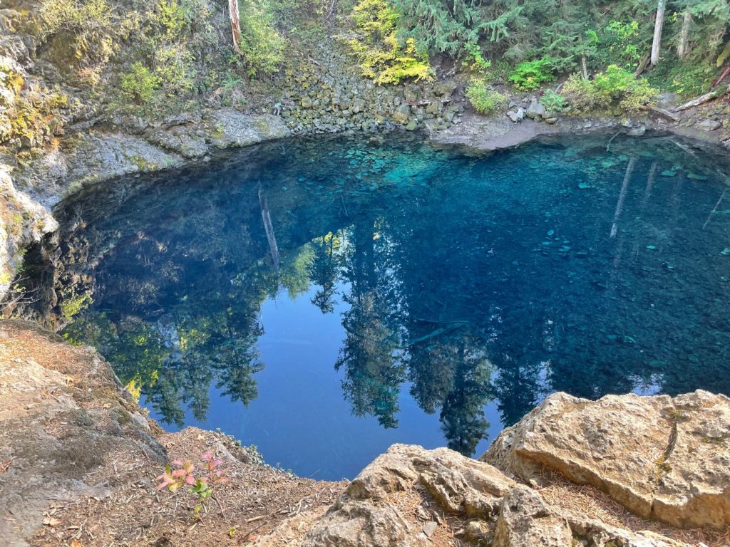
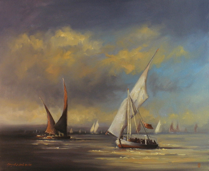
The answer was not really all that surprising because we see it all around us every day. It is of course, the color of the sky, the Mediterranean ocean, Daniel Craig’s eyes, Crater Lake, a dapper sailor’s uniform, comically gallant peacocks, houses, blue jeans, shoes, gemstones, delphiniums, Flow Blue China, Gainsborough’s Blue Boy, tropical lagoons, Saphire gin, a New Mexico sky at twilight, and countless animal, vegetable, mineral, organic, and man-made items that you can fancy.
And the Survey Shows
The survey winner was overwhelmingly blue with green and red trailing behind. Because blue nestles between green and red on the color wheel it is not unexpected that they follow along in popularity. Some blues such as ultramarine lean toward the warm or violet spectrum meaning they contain some red. Contrarily they might tip the other way to a greenish tone similar to turquoise. Some blues are as cold as a Siberian winter. Others boast a smoldering blue-violet warmth such as that emanating from the blossoms on a Yankee Doodle lilac tree.
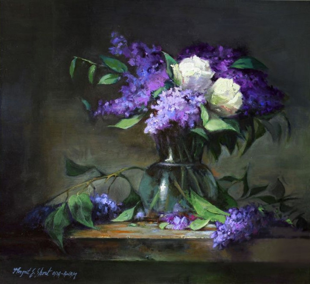
Ultramarine and Phthalocyanine Blue
Colors from the Earth vs. Synthetic
There are two types of artists’ pigments, natural and synthetic. Prior to 1726 when the first man-made synthetics were manufactured, artists had only the colors from nature.
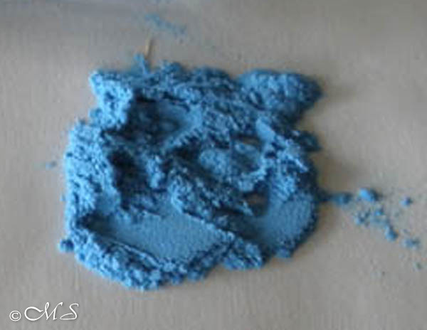
This is true for all the blues with the exception of one, Egyptian Blue Frit.
Technically it is a synthetic, but it is classified as historical because it was made by the ancient Egyptians thousands of years ago. Today it is used by pigment nerds like me who find great satisfaction in making and using colors from the past.
Margret E. Short Copyright 2009 Egyptian Blue Frit
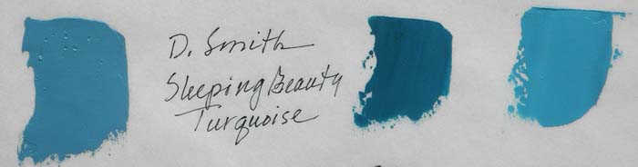
Sleeping Beauty is Not Just a Fairytale
In the coming weeks, I am launching yet another pigment project using both synthetic and natural blue as a focal point in each new painting. This is in preparation for the Spring Unveiling at the Bronze Coast Gallery in Cannon Beach, Oregon where the entire series will be revealed at the reception on May 6th. More details are to follow. As the weeks progress, I will document details about each blue used and expose ridiculously teeny teaser peeks of the compositions but save the final reveal for the main event in May.
Coming Soon! Bronze Coast Gallery Unveiling:
Quintessential Blue
Your artistry and new color project will honor my favorite color – the color blue. Can’t wait to see Spring Unveiling!
Hello Diane, It really is surprising the number of people who favor blue. Maybe it is because it is calming to the human psyche and most likely to animals too. While going through my box of paint, I was quite surprised to find so many different varieties.
I have long thought the blue of Cornflowers to be singularly attractive. It was also a favourite of Edward Alleyne, who was one of Shakespeare’s actors.
Hello Gerald, Blue cornflowers have a special beauty in the natural world. Not knowing much about Shakespeare, I find Alleyne’s preference for blue quite interesting. I’ll keep that fact in mind for future blue stories.
Blue is my favorite color, all the beautiful shades of the ocean! Looking forward to your show in May.
And I love the “pigment nerd” term😉
Hello Holly, So glad to know you are a ‘blue’ fan too. In the art world, it is versatile and popular. In the human world, I find it soothing and calming. I think I have always been a pigment ‘nerd’.