 Often in this blog documentation, I have talked about color saturation. This is very important to anyone using color in any way, no matter the medium. The saturation of a color, paint, or dye, is the intensity of the pigment, meaning how weak or powerful it is.
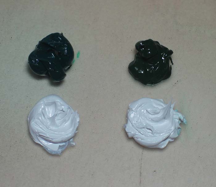
Often, I have mentioned a color having a weak tinting strength, especially the earth greens. Here I have images of two different greens and two blobs of the white in exactly the same amounts of paint.
On the left is a viridian green which is NOT a historic pigment, but was developed in modern times. It is a pigment widely used today in most mediums including oils, watercolors, and others. It has a very high saturation meaning high tinting power. In fact it is a powerful color that must be controlled or it will take over other pigments.
On the right is Verona green earth which IS a historic pigment and has been used for centuries. It has a very low tinting strength and will never over take others. Even if you add gobs to other colors it will not do much to alter that other pigment. For example, it can be added to a red and it will just gently alter the red.
 As you can see here in this image, after mixing the white into the greens, how much more powerful the viridian green (on the left) is over the subtle color of the verona green earth (on the right). Remember, they were mixed with exactly the same proportions.
This is one of the major differences between all of the modern pigments versus historic ones. None of the historic pigments I have been experimenting with are powerful colors, but instead, they are lovely subtle natural tones. They are easily controlled and have a harmonious appearance, meaning they look pleasing together. This is one of many reasons why this Lessons from the Low Countries project/experiment has been so exciting and revealing.

Thanks for another great demonstration. Viridian, PG18,can really be a troublesome color easily abused.Mixtures with white are often rank,crass and artificial. For decades it has shown up in student art, across the country,like a bad hangover from another college-all you can drink- night. Thanks for revealing your art of subtlty and luminosity in color.
Dear Margret, regarding your mixture of Viridian and Veronese Green Earth I want to remember, that in the old days there was only Lead White as white pigment available. Your mixture looks very much like made with Titanium white. Titanium White is not a historic pigment. Its hiding power is much stronger than that of the real historic Lead white. If you mix in part the wrong pigments I doubt you can compare the real colors. In my opinion the real Veronese Green was like a transparent layer ( with nearly no white) underneath the red in the Netherlands paintigs. Best regards Georg Kremer