Well, it’s time for the big reveal of a few of the initial works completed in the last weeks using colors from the pharaoh’s tombs. As mentioned before this pigment project has been more of a challenge than the Dutch themed one. The most important issue is there are fewer colors and even fewer vibrant ones.
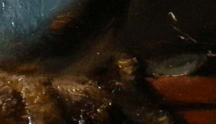
This detail below is from the Painting #1 in the Egyptian series and is small, measuring 10×8 inches. This decision was a calculated one and meant to be a method of getting the feel of the pigments themselves. This is much easier to accomplish on a small format.
The color in the upper left corner is a combination of Egyptian blue and azurite both of which were used often dating from about 2500 BC. I used it to depict an alabaster jar purchased while in Egypt. According to Anne Varichon in her book, Colors, the Egyptians were the first to use azurite in painting. To artists today it is also known as blue verditer, bice, and Mountain blue.
This pigment is a natural carbonate of copper and is found all over the world along with malachite. It is reliable for permanence and is moderately toxic so care should be taken while handling. I found it somewhat difficult to work with as the texture is gritty, though the color quite beautiful.
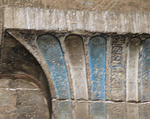
Above is a somewhat blurry image I took in the temple at Dendura showing a wall decorated with blue pigment.This is most likely azurite or Egyptian blue and was the color most prevalent in many of the tombs and temples we toured.


Love the blue azurite and I love malachite stones, I can’t wait to see how that translates on canvas!
Margret: Be sure to read about the pigments they found in conserving the Acropolis–ones they always suspected were there but have apparently now found. Of course, I didn’t read the details, but the headline looked enticing. It may have been a Michael Kimmelman article in the NY Times.