Quintessential Blue Pigment Project has been great fun for a pigment nerd like me. For this series, I used some unusual colors on my palette with unexpected surprises. One is the cobalt turquoise and the other manganese blue that both are now my all-time favs. Though neither are historical colors, I know I will continue to explore making and using them. Part of the fun is hunting for colored objects that are suitable to use in compositions.
The Fun is in the Hunt
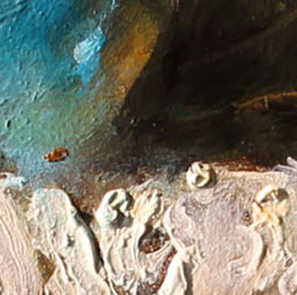
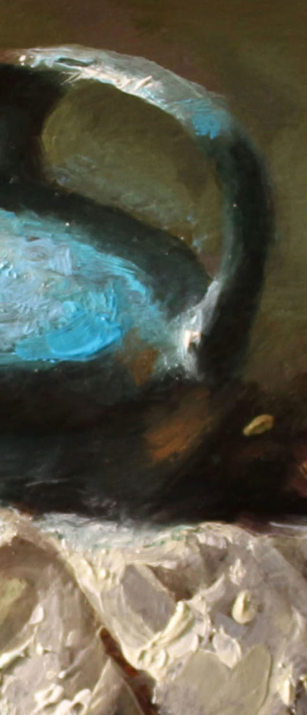
Manganese Blue is an outrageously gorgeous color that is so palpable it can dominate a composition easily. The trick is to choose your color scheme wisely and use a limited palette and let the manganese be the star performer.
In the sneak peek #6 composition, I have used very few colors, and the color of the jar is the focus. Everything else is supporting the main character.
Just one other color is utilized in a small muted yellow flower to the right peering out of the shadows. All other colors in the entire composition are muted grays, greens, and warm dark umbers. By using only one dominant color that is surrounded by muted tones, allows the manganese beauty to shine through.
A Modern Synthetic
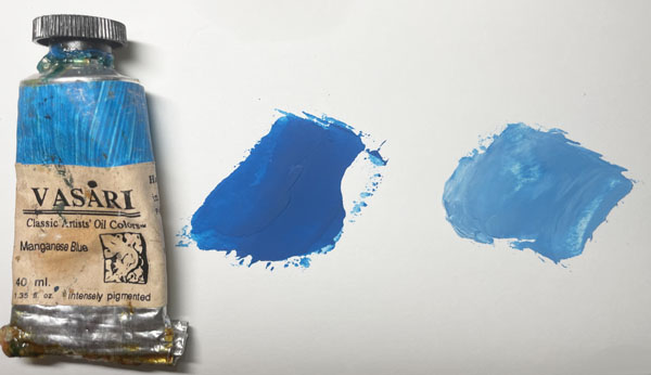
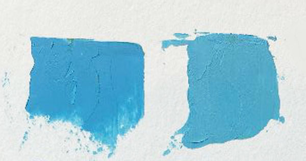
Anthraquinone Blue is a powerful saturated pigment and is made into oil, watercolor, and acrylic by many of the big paint makers. I used M. Graham for this project in peek #7. In its purest form, it is nearly black and mixing in burnt umber will warm it slightly which makes a very very dark warm black.
You can see in the peek I added warm burnt sienna, lower left, to the dark blue to warm the shadows to add translucency.
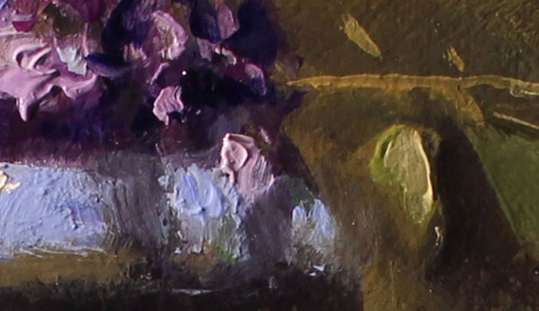
I find that I do not like to use many colors in one composition. I prefer a limited palette of one dominant color, and one or two complements used sparingly.
As do several of the paintings in this series, this piece has a large section of lace. It is best when doing something that is white, to use some of the colors in the other objects here and there in the lace. This will pull everything together into a cohesive composition, meaning, all objects belong and are in harmony with each other.
Final Peek #8 Isn’t Just a Pigment
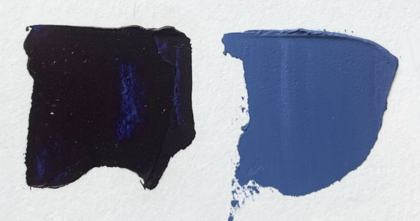
Sevres Blue, pronounced sevs, comes from a well-known French company that makes porcelains such as vases and other decorative items. They are often painted a delicate shade of blue called sevres. The only reason I know this is because I see these items on Antiques Roadshow often. In recent years some of the paint makers have begun to manufacture a paint of the same name.
Again, I have used this blue on the main focal object, a vase. Following through with my tried-and-true technique, the blue object is the main interest and therefore is painted the brightest dominant color with surrounding lesser saturated pigments.
Countdown
So, there you have it! All 8 peeks. Countdown to the Unveiling is just hours away at 5 o’clock the evening of May 6. There are other unveilings and events throughout Cannon Beach over the weekend.
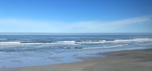
The final stretch is the drive to Cannon Beach. By the time you read this I will be at the gallery to join in the festivities. I look forward to meeting there.
Parting Shots
Spring Unveiling coming May 5 through 7,
Cannon Beach, OR
Quintessential Blue
Thank you all for following along another colorful journey. All the final images will be revealed Sunday afternoon when I return!