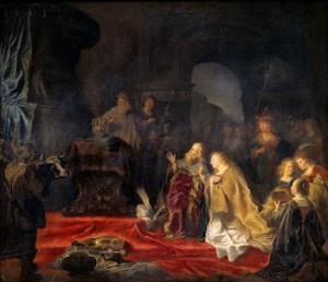
Time has come finally to tackle one of the Rembrandt’s from the Rembrandt and the Golden Age of Dutch Art exhibit as a source painting. This is a very intimidating quest indeed. My approach was not to think about the genius of Rembrandt, but to concentrate on his colors and probable pigments used. By thinking of it in this manner, the task was not so daunting. For painting #9 Rembrandt’s Denial of St. Peter became my palette.
This masterpiece is also a shining star of the exhibit. The Dayton Art Institute grouped three of the largest together, this one by Rembrandt, the King Solomon by Salomon Koninck (used for #8), and Govert Flinck’s Isaac Blessing Jacob (used for #4).
Each was similar in size and had striking vibrant color, none of which I could resist. Because they were hung so near to each other it was exciting to compare each artist’s skill level and approach. It was apparent Rembrandt influenced Flinck and Koninck profoundly, as the differences were almost indiscernible. There were similar components to each also: dramatic, chiaroscuro, luscious color, and lavish costumes.

According to the exhibit catalog, the face of St. Peter is illuminated with a candle, although the hand of the girl next to Peter blocks the candle itself. Parts of the painting remain unfinished. Something that was not uncommon for Rembrandt in his later paintings. He employed the use of a palette knife for some of the passages, which was new to his style also.
Some of my catalog notations from Dayton are:
- overall too dark
- green/grays are lost, but mostly color is good
- should be lighter in focal area
- cinnamon tones
By using this painting as my palette, choices were somewhat restricted; a true “limited palette” of lead white, vermilion, green earth, umbers, earths, black, and lead tin yellow. Again, an endless variety can be mixed from a few pigments. Surprisingly, a glowing bluish/gray can be made with white and black.
Several months ago while doing research for this project, the conservation department at the National Gallery counseled me on Rembrandt’s palette: black, umbers, ochres, siennas, azurite, smalt, carmine, vermilion, lead tin yellow, white, and a few lakes.

The term often used to describe Rembrandt’s palette is “friendly colors.” If you will recall my descriptions of the natural historic pigments, they have a subtle “harmonious” or “friendly” beauty.
The ninth painting in my Lessons from the Low Countries series is quite a departure from the first eight. It has been my desire for years to do a true “Five Senses” piece. In this rather large canvas, 30×26 there are objects representing touch, smell, sight, sound, and taste, which cover all the senses. Red dominates and copious amounts of vermilion were repeatedly mixed on the grinding slab, as were many darks, umbers, and black.
Many times over, burnt or raw umber was mixed into the black to hasten drying. As mentioned before, this can be a huge issue and drawback to the black, but can be helped with the addition of those indispensable umbers.
