Painting objects using violet and purple shades is always a challenge because it is easy to land on the garish side of this hue. We have all seen a house painted this color and we say “Whoa! That’s intense!” Another example is painted flowers and fabrics that make your eyes water. So how to avoid this error in the use of purple/violet shades?
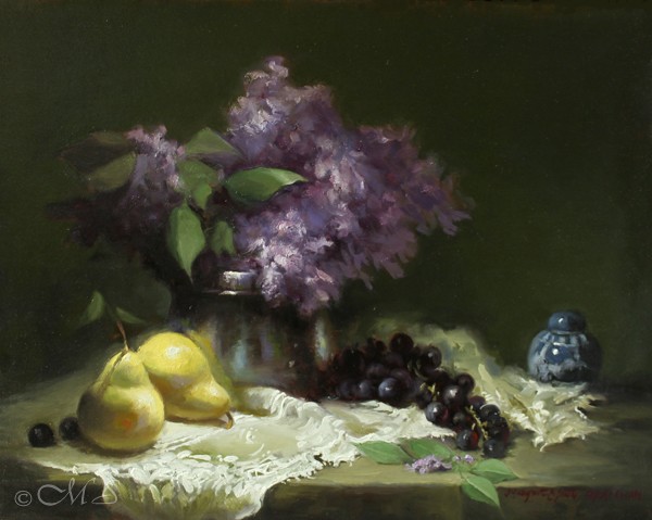
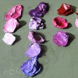
The solution is to mute the colors. Subtle is always the best route when using any purple pigment. Here, in the latest Iso-LACE-tion painting, I have used a combination of quinacridone magenta, ultramarine blue, and white. Into that, I mixed a little black to calm it down even more.

On the color wheel, yellow is the complement of purple, which means they can either enhance or cancel each other. If you mix a yellow tone into a violet/purple, it will automatically knock it down or gray it out. Contrarily, if you place them side by side, as I have done here, they will look quite beautiful.
A Color for Royalty Only: Others Can Be Prosecuted or Worse
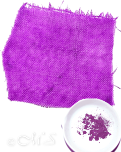
Prior to about 1750 – before synthetic pigments were commercially made – pure violet hues were impossible to attain from natural pigments. The exception is one that I have written about in the past, and this topic has been an ongoing fascination with followers of this blog. I first discovered it during my research for the Lessons from the Low Country Project.

Tyrian Purple is made from the Purpura Lapillus, a shellfish (sea snail) that excretes a beautiful purple dye. Centuries ago, this dye was used to adorn cotton, silk, and wool robes of royalties and religious figures. It takes approximately 10,000 sea snails boiled in huge vats for days to make one gram of this color. Today it is available for a mere $2769. for 0.007kg from art material suppliers, although probably not your local Michaels Craft Supply! This minuscule amount adds up to .25 of an ounce.
Since antiquity, Tyrian Purple was so coveted that anyone outside of royalty or the church was forbidden to wear clothing made from the precious pigment. In Roman times, the Emperor had sole access, and the laws were very stringent. The phrase ‘to don the purple’ meant ‘become the emperor.’ This explains why the color was used frequently to denote royalty. The royal’s “ownership” of the color lasted until around the 15th century, but it didn’t become widely available until the 1850s when the first synthetic dyes could be mass-produced (History.com).
Many Companies Make Vibrant and Readily Available Purple/Violet Colors

Most paint suppliers today manufacture excellent and beautiful varieties of violet/purple/lilac for a modest price. A full spectrum is available: from light to dark, dull to vivid, highly saturated to grayed-out. Purple, carmine, cobalt violet, permanent rose, mars violet, magenta, quinacridone violet can be used alone or mixed with blue all make luscious shades.
Less is More
Whenever I want to include purple or violet in a composition, I use the old adage of less is more. Restraint in a limited palette is always a smart and auspicious color composition, as I have done with Syringa’s Transformation above. A few shades of pale muted yellows/ochres, black warmed with alizarin, muted green, white, muted blue/black for the small vase, and the variety of violet/purple for the lilacs. As you can see, nothing is garish; nothing is melting the paintbox. By muting the colors surrounding the lilacs, makes them the star performers. Less is more is always a good strategy, and has always served me well.

Fascinating and informative as usual. We get a history lesson as well.
Hi Joanny, So happy that you enjoyed a little bit of history. I can’t resist the historical pigments and the stories that go along with them.
I find your paintings so beautiful. I also, very much, appreciate the background of information, explanations, and visual examples you share with us. I always look forward to receiving your emails.
How do you go about creating that lace/crochet on canvas with paint? It’s amazing how you are able to capture the delicateness of the handcrafted work.
Thank you so much!
G. Romero
Hello Mrs. Romero, Thank you so much for your very nice comments. I do love to know that followers are enjoying the new paintings and the stories about the historical pigments. So many of these stories are very quirky and that is what makes them so interesting. Till next time!
Thank you! This article was great! You explained it so well.
So glad you liked the story of the $$$$purple pigment. Someday I would love to have some and use it in a painting.
So beautiful! I admire your work so much and enjoy the history you share on the colors…..Thank you
Thanks Becky! I do enjoy delving into the history of those beautiful pigments. So many quirky stories that are completely true.
Your talent is beyond words or measure! So beautiful.
Wanda B.
Thank you Wanda. Hope you are keeping at your painting too.