Many of you have asked about the pigments used by the featured women artists in Part Two of Dancing Backwards, More Lessons from Fred and Ginger. This is where my Mad Scientist Pigment Nerd Self gets itchy. For decades now, I have been delving into the historical materials and techniques side of painting. This is as interesting as the actual painting part of being an artist. Nothing is more fun than sitting down with a cup of coffee by the fire with a good book about how to stretch a canvas or grind some yellow ochre the way it was done centuries ago. With few exceptions, what I have learned is that these tried-and-true methods are as sound today as back then.
1750 is a Giveaway Clue
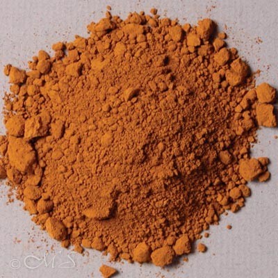
When examining colors in paintings dated prior to 1750 or so, we know that colors mined from the earth, mineral pigments, and a few organic hues were the only colors available. Plant-based colors such as indigo and henna were notoriously unreliable because they were impermanent and faded quickly. Cochineal made from a tiny bug is one of the organic archivally safe pigments still in use today. Interestingly, it is used for coloring food items like cherry sweets, yogurt, ice cream, and sodas. Starbucks discontinued its use in their Strawberry Frappuccino back in 2012 after a fierce backlash from the public.
Winsor and Newton; the Penn and Teller of the Color World
1750 is a significant timeline. Approximately after this date, synthetic colors were coming on the scene and were manufactured in laboratories, then mass produced by colormen such as Winsor and Newton. One other significant invention in 1822 was the paint tube. Prior to this, artists and assistants hand-ground just enough paint to last a few days then stored in pig bladders.
‘Over the Sea’ Blue
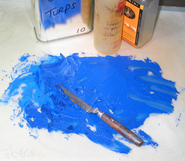
This overview is an easy timeline to determine and approximate the identity of the pigments used in a specific painting. Of course, absolute identification of a certain pigment cannot be proven unless it is scrutinized under a microscope. As an example, if I see a green in a painting dated before 1750, I know it most likely is terre verte, malachite, or maybe a combination of yellow ochre and blue or black. If the color is an eye-popping clear blue, it probably is lapis lazuli. In a way it’s like sleuthing your way through the investigative color question. So, I scratch the itch and rely on my pigment nerd self to make a logical determination.
Who Used What and Why?
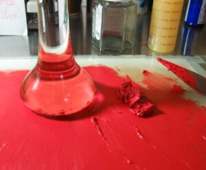
Back to the women artists in the Dancing Backwards Project. Michelina Woutiers, Sofonisba Anguissola, Rachel Ruysch, and Elisabetta Sirani all lived and worked before 1750. This means they might have used the colors above with the exception of cadmium red which was invented in 1817. Most likely they all used copious amounts of earth colors like raw sienna, yellow ochre, ivory black, and umber for the simple fact they are very inexpensive. If they had wealthy patrons or clients, they probably used lapis as it was very expensive as was genuine vermilion and malachite.
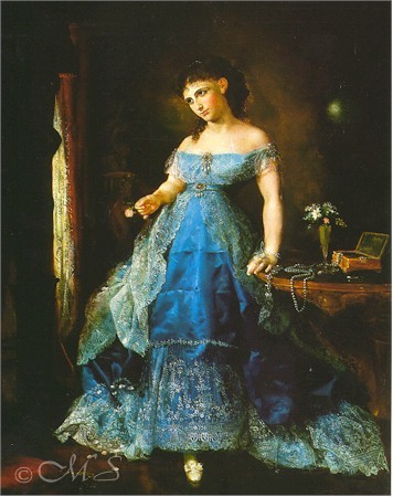
The women who lived and worked after 1750 most likely had many of the earths plus some of the synthetics on their palettes as they came along such as the cadmiums and ultramarine blue. Lilly Martin Spenser, Berthe Morisot, Christine Kielland, and Emma Sandys would fit into this category. Next time you go to a museum check out the paintings containing a vibrant clear blue garment. If it is heart-throbbingly wondrously gorgeous and stands out over the other pigments, it’s probably lapis. Put your pigment nerd self and inner Sherlock Holmes to work. Learning about the materials and techniques of the past becomes endlessly captivating.
Hi Margret, a long time passing, sorry. Your painting and exploration of themes is always intriguing. So your idea of color sleuthing moved me beyond ultramarine PB29 to another clue: the image of the bottle of oil from Cennini/Studio Products. Rob Howard moved his pigment and paint production to my little town of Athens, Ga. His son Max took over the operation but after a few years everything closed down. Maybe not enough of us curious paint nerds. Keep on painting in the free world.
Hello Sander, So nice to hear from you. Yes, as you know I do love investigative work concerning the art world. Choosing certain topics leads one into the unknown. I always learn new and fascinating things about colors, artists, and materials. I did not know that Rob Howard moved his operation to Athens, but I do remember that he just slowly faded away. His products were always interesting to me, and I used many back then. Thankfully, today there are other companies that specialize in historical products and publish many papers on rare techniques and materials. Reading over the sites is like a walk through time. I plan on painting in the free world as long as possible. I hope you are too!
Your fellow color nerd!