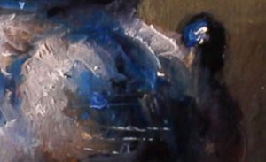
Time is getting crunchy now and there are five more paintings to go. The only solution is to do multiples in each post until peeks are revealed before the Spring Unveiling event this coming weekend. So far, the blues covered are the ever-glorious lapis lazuli, its modern equivalent, ultramarine blue, and a personal favorite, cobalt turquoise blue. … [Read more...] about Brushing Down the Home Stretch
Pigments: Historical and Modern
There is a distinct difference between modern day pigments and the natural pigments used prior to the middle of the 1700s. In the past, artists had apprentices who ground the colors for them throughout the oil painting sessions. Because they were made by hand, the pigments retained a natural grittiness and consistency with larger particle size. Today's oil paint manufacturers make synthetic colors in huge vats where the end result is exceptional smoothness. Prior to the middle of the 1700, natural pigments came from dirt, minerals, and even plants.
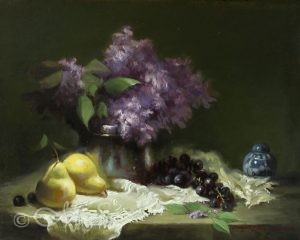
A Mystically Beautiful Combination
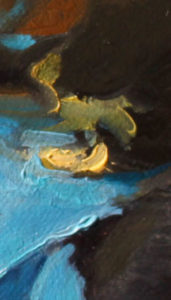
Time is of the essence now as the big Spring Unveiling event is approaching quickly. May 6 will be here faster than my paint strokes can dry on the canvas. Sneak peek #3 is now revealed! For this 8x6 vertical composition, I have used two blues that complement each other beautifully; ultramarine blue and cobalt turquoise blue. This cobalt hue is … [Read more...] about A Mystically Beautiful Combination
Ultimate ‘Over the Sea’ Ultra-marine Blue
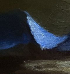
Lapis lazuli has long been one of my favorite specialty blue colors for previous pigment projects and a perfect choice for the current Spring Unveiling at Bronze Coast Gallery. Artisans around the world have used this mineral for jewelry, inlays, furniture decorations, paint, tombs, and temples in endless varieties. Seventeenth Century Dutch … [Read more...] about Ultimate ‘Over the Sea’ Ultra-marine Blue
A Gem of a Color
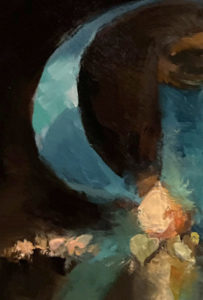
As, promised, the first ludicrously small sneak peek in the blue pigment project is revealed. Sleeping Beauty Turquoise Blue! This pigment has a compelling history and is known for its clear blue beauty. A fabled mountainous vision of a cross-armed sleeping woman identifies the area near Globe, Arizona where the mines are located. Good and … [Read more...] about A Gem of a Color
Lessons from the Unfathomable Colors of the Oceans

Back in 1994, when I was just barely sure of what I wanted to be as an artist, I found an intriguing semi-official survey taken by two serious-minded artists named Alex Melamid and Vitaly Komar, both Russian emigres. Along with other art preferences, they set out to find which color is most overall favored adored and desired by ordinary … [Read more...] about Lessons from the Unfathomable Colors of the Oceans
Using Violet and Purple Pigments in Oils: Challenges and Solutions
Painting objects using violet and purple shades is always a challenge because it is easy to land on the garish side of this hue. We have all seen a house painted this color and we say "Whoa! That's intense!" Another example is painted flowers and fabrics that make your eyes water. So how to avoid this error in the use of purple/violet … [Read more...] about Using Violet and Purple Pigments in Oils: Challenges and Solutions